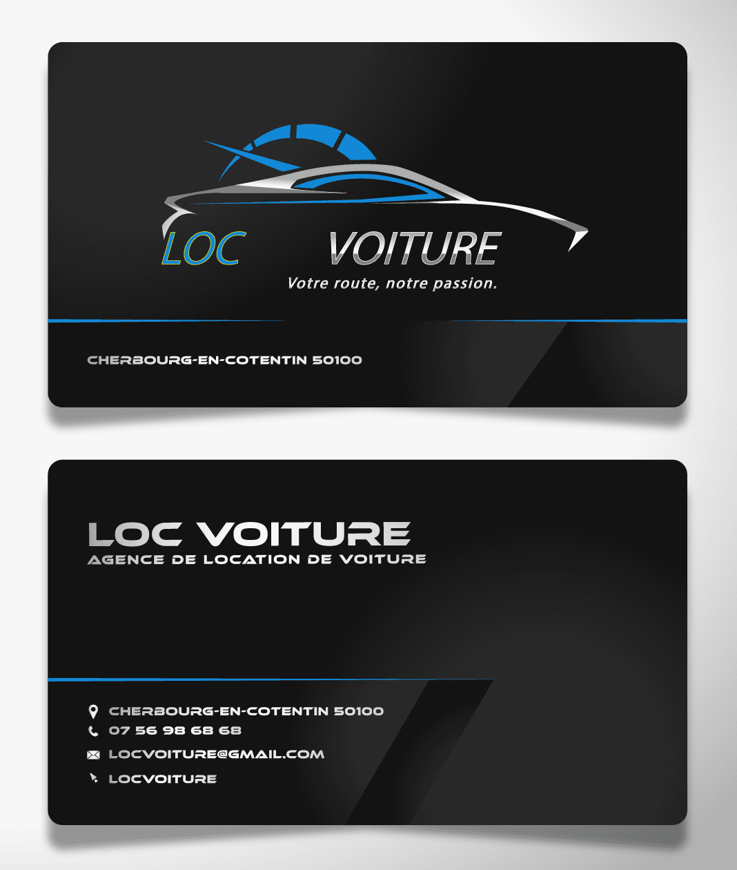
A premium business card for a car rental agency
Published on September 14, 2026 · 3 min read
The brief
A visual identity and business card for a car rental agency. Unlike a digital medium, a business card is also judged by touch and physical presence: it has to convey seriousness and service quality in a single handshake.
The process
The work combined two tools: Illustrator for the vector construction of the automotive logo and layout (guaranteeing crisp print quality), and Photoshop for the finishing touches — subtle textures on the black background, light and reflection effects that give the card its premium feel.
The choice was a black base with a cyan accent (#06B6D4) for a modern edge, rather than the "warmer" codes sometimes seen in the automotive world. The goal: evoke premium and restraint rather than budget availability.
The automotive logo was designed to stay legible even at the small scale of a business card — one of print design's classic traps, where a detail that works on screen becomes unreadable once printed small.
What I take away from it
Print design has constraints digital doesn't: real size, print quality, physical contact. Designing without having tested the final object in hand risks discovering the problem too late.
Written by Demba Mbow
Digital creator & UI/UX designer, WCAG certified
Was this article useful?
Let's talk about your project