Branding that makes you hungry: the Burger Street banner
Published on September 14, 2026 · 4 min read
The brief
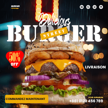
A social media banner for a fast-food brand. The brief fit in one sentence: make people hungry at a glance, without relying on a long text nobody will read while scrolling.
The process
The visual was built in Photoshop. The burger photo went through a classic food-photography retouch: boosted contrast and saturation, sharpened texture detail (toasted bun, melted cheese, sesame seeds) for an appetizing finish, and color correction to make the lighting consistent across the composited elements.
Choosing orange (#F97316) wasn't arbitrary: it's a color that stimulates appetite and already dominates the visual codes of the sector (from McDonald's to local brands). The challenge was fitting into those recognizable codes while keeping an identity of its own.
The copy was designed to be read in one second, with a layout guiding the eye from the product visual straight to the call to action, no detours.
What I take away from it
In food branding, color does 80% of the work before the text is even read. Understanding a sector's existing codes — to follow them or deliberately break them — is a step you can't skip.
Written by Demba Mbow
Digital creator & UI/UX designer, WCAG certified
Was this article useful?
Let's talk about your project