Designing a poster that makes people want to go out: NAZA Night at KissDISCO
Published on September 14, 2026 · 4 min read
The brief
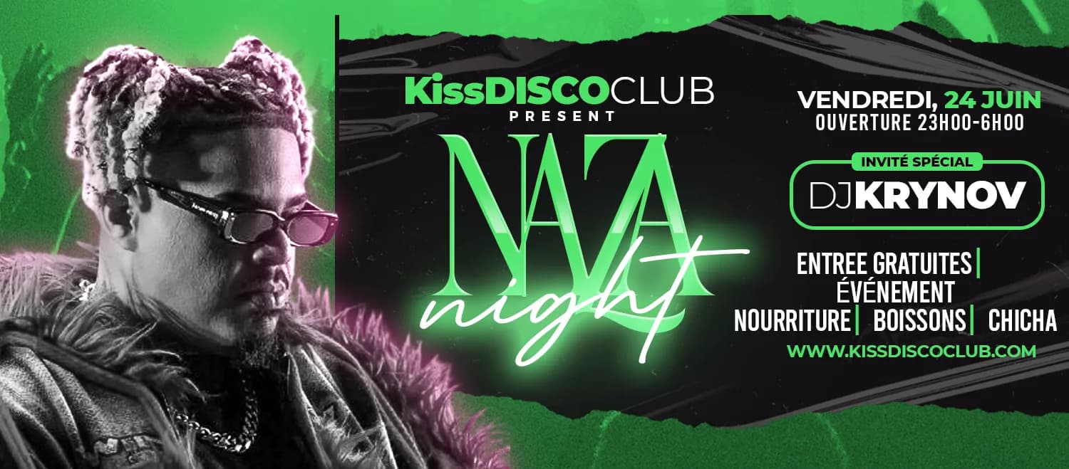
An event poster for the NAZA Night party at KissDISCO Club. The goal was simple to state and demanding to pull off: grab attention in a split second on an Instagram feed or story, and make people want to book a spot.
The process
The visual was built entirely in Photoshop, starting from the mood we wanted: a high-energy night out with a confident neon identity. The bright green accent (#10B981) serves a precise contrast goal — standing out from typical party posters, which usually lean on purple or pink.
The neon effect relies on stacked layer styles — outer glow for the light halo around the typography, inner glow to give the letters some thickness, and a light Gaussian blur to simulate light diffusion, just like a real neon sign.
Typography was treated as a graphic element in its own right, not just information: practical details (date, venue, hours) stay readable at a glance, while the event name owns the space with impact.
What I take away from it
An event poster has a constraint few other formats share: it has to work both at large print size and as a thumbnail in a social feed. Designing with both uses in mind from the start — rather than shrinking a print poster afterward — completely changes how you prioritize information.
Written by Demba Mbow
Digital creator & UI/UX designer, WCAG certified
Was this article useful?
Let's talk about your project